menu
Deichmann kids
Deichmann kids logo design
00
00
00
00

status quo
status quo
status quo
Many other fashion brands have developed distinct kids logos that emphasize playful elements such as bright colors, rounded typography and fun shapes to appeal to children and their parents. These logos often focus on creating a sense of friendliness, energy and approachability, clearly differentiating the kids’ line from the main brand while still maintaining visual consistency.
Many other fashion brands have developed distinct kids logos that emphasize playful elements such as bright colors, rounded typography and fun shapes to appeal to children and their parents. These logos often focus on creating a sense of friendliness, energy and approachability, clearly differentiating the kids’ line from the main brand while still maintaining visual consistency.
goals
goals
goals
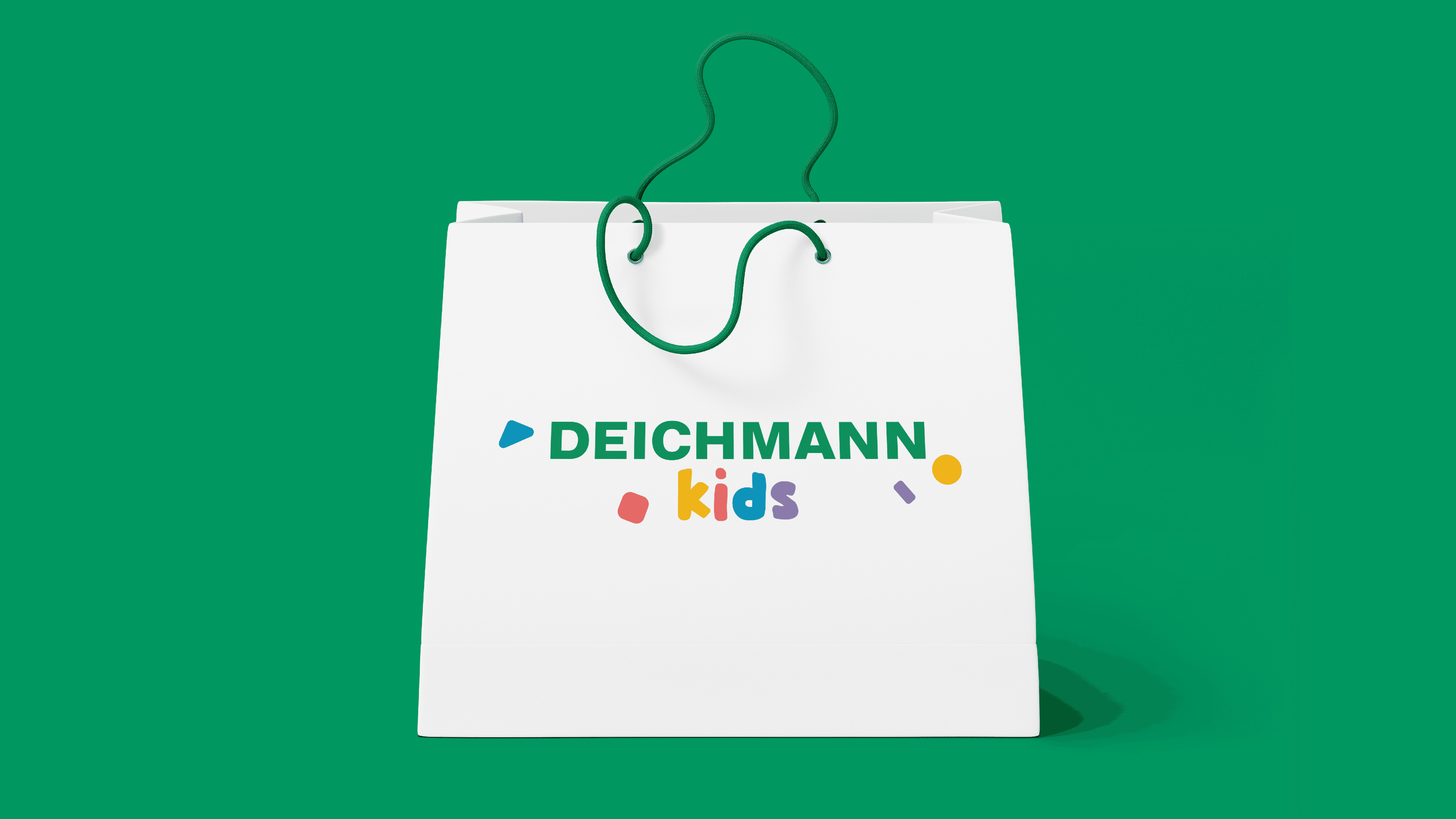
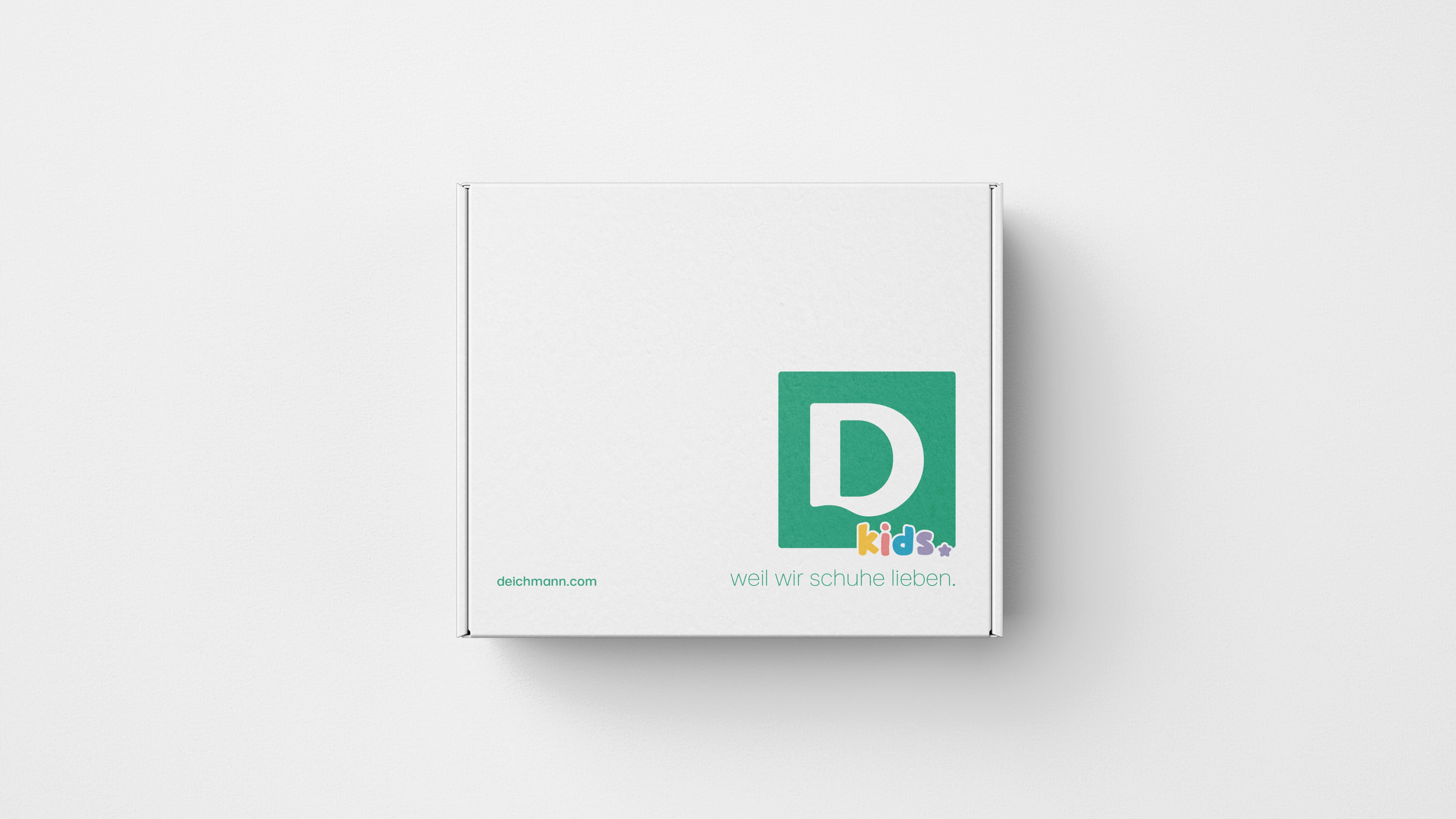
The goal of this logo design was to create a more engaging and kid-focused visual identity that still aligns with Deichmann’s established brand. To achieve this, the signature Deichmann green was combined harmoniously with the secondary color, giving the logo a fresh and lively appeal. The letter ‘D’ was filled with various shapes to enhance its playful quality and underscore its connection to children. This new design seeks to strengthen brand recognition while resonating with both kids and parents alike.
The goal of this logo design was to create a more engaging and kid-focused visual identity that still aligns with Deichmann’s established brand. To achieve this, the signature Deichmann green was combined harmoniously with the secondary color, giving the logo a fresh and lively appeal. The letter ‘D’ was filled with various shapes to enhance its playful quality and underscore its connection to children. This new design seeks to strengthen brand recognition while resonating with both kids and parents alike.
The goal of this logo design was to create a more engaging and kid-focused visual identity that still aligns with Deichmann’s established brand. To achieve this, the signature Deichmann green was combined harmoniously with the secondary color, giving the logo a fresh and lively appeal. The letter ‘D’ was filled with various shapes to enhance its playful quality and underscore its connection to children. This new design seeks to strengthen brand recognition while resonating with both kids and parents alike.
The goal of this logo design was to create a more engaging and kid-focused visual identity that still aligns with Deichmann’s established brand. To achieve this, the signature Deichmann green was combined harmoniously with the secondary color, giving the logo a fresh and lively appeal. The letter ‘D’ was filled with various shapes to enhance its playful quality and underscore its connection to children. This new design seeks to strengthen brand recognition while resonating with both kids and parents alike.
year / timeframe
2023 / during Internship
year / timeframe
2023 / during Internship
year / timeframe
2023 / during Internship
year / timeframe
2023 / during Internship
tools
Photoshop / Illustrator / Indesign
tools
Photoshop / Illustrator / Indesign
tools
Photoshop / Illustrator / Indesign
tools
Photoshop / Illustrator / Indesign
category
Branding and Identity
category
Branding and Identity
category
Branding and Identity
category
Branding and Identity
credits
GREY Design Team
credits
GREY Design Team
credits
GREY Design Team
credits
GREY Design Team
01
02

03
see also